Enterprise fonts are professional typefaces designed to reflect a company’s identity and values across various platforms. These fonts are carefully chosen for their clean lines, high readability, and versatility, making them ideal for branding, corporate communications, and marketing materials. They help establish a consistent visual identity, ensuring logos, websites, and documents look polished and cohesive. Common traits of enterprise fonts include elegance, modernity, and a balance between aesthetic appeal and functionality, catering to both digital and print needs.
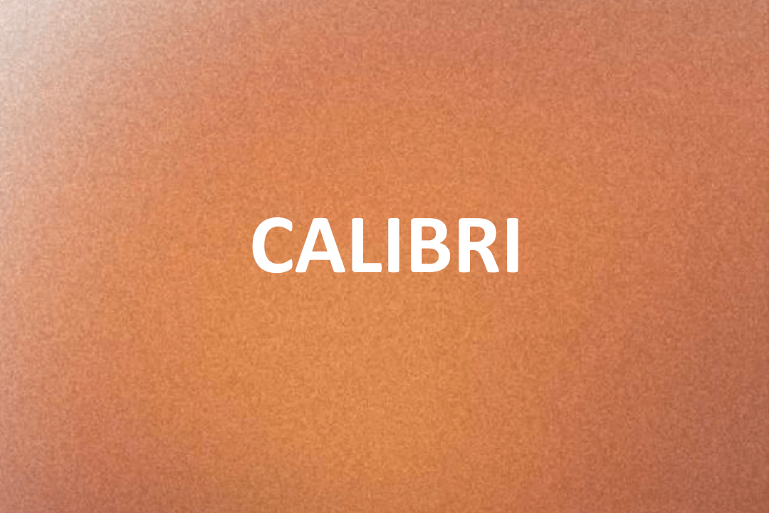
Calibri
The Calibri Enterprise Font is a highly popular typeface known for its modern, clean, and professional appearance. Designed with simplicity and functionality in mind, it has become a go-to font for businesses and organizations worldwide. Its smooth curves and rounded edges give it a friendly yet formal feel, making it suitable for various corporate applications.
One of the key features of Calibri is its high readability, both on digital screens and in print. The even spacing and balanced proportions ensure that text looks clean and uncluttered, even in smaller sizes. This makes it perfect for presentations, reports, email communication, and other professional documents.
Calibri is part of the default Microsoft Office suite, which has contributed to its widespread use in enterprise environments. Its versatility allows it to work well in formal settings while maintaining a modern and approachable aesthetic. The font supports a wide range of languages and characters, making it ideal for global companies with diverse audiences.
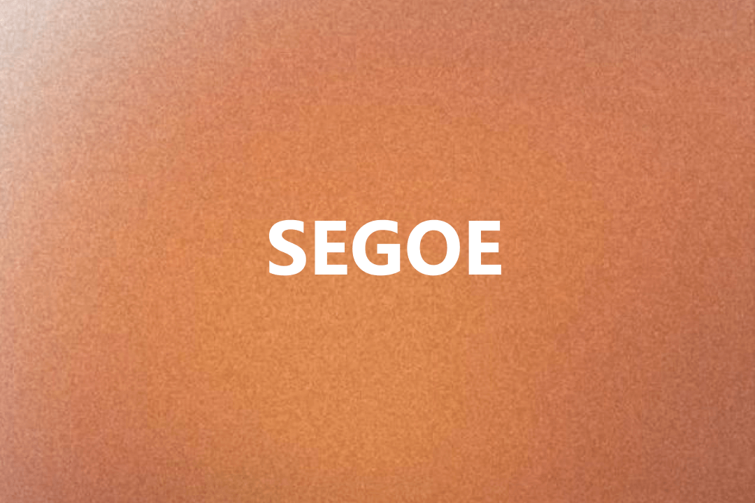
Segoe
The Segoe Enterprise Font is a versatile and modern typeface designed for professional and corporate use. Known for its clean lines and contemporary style, Segoe has become a popular choice for businesses seeking a polished and approachable aesthetic. It is often associated with Microsoft’s branding, as it is the official typeface for many of the company’s products and interfaces.
One of the standout features of Segoe is its excellent readability across various platforms, including digital screens and print materials. Its simple yet elegant design ensures that text appears clear and professional, making it ideal for presentations, websites, business reports, and marketing materials. The font’s consistent spacing and well-balanced proportions add to its sleek and organized appearance.
Segoe supports a wide range of weights and styles, such as regular, light, bold, and italic, giving businesses the flexibility to use it for everything from headings to body text. Its global character set accommodates multiple languages, making it suitable for companies with an international audience.
Open Sans
The Open Sans Enterprise Font is a highly popular typeface that is widely used in corporate designs, web development, and business communications. Designed by Steve Matteson, this font is known for its clean lines, modern look, and excellent readability on both digital screens and printed materials. It’s often used in websites, presentations, email templates, and marketing materials, where a professional yet approachable appearance is essential. Its balanced proportions and clarity make it ideal for headlines, body text, and even small captions.
Open Sans is best suited for UI/UX design, corporate branding, and content-heavy platforms. Its neutral and friendly appearance ensures that it works well in both formal business settings and modern digital environments. Since it supports a wide range of languages and comes in multiple weights like regular, light, bold, and italic, it is perfect for companies with a global audience. Its adaptability across different formats makes it a favorite among designers and developers alike.
In summary, Open Sans is a versatile and reliable font that balances modern style with professionalism. Designed by Steve Matteson, it has become a cornerstone of enterprise typography, offering businesses a consistent, polished, and readable option for various communication needs. Whether for web content, marketing designs, or corporate presentations, Open Sans is a trusted choice for creating a clean and effective visual identity.
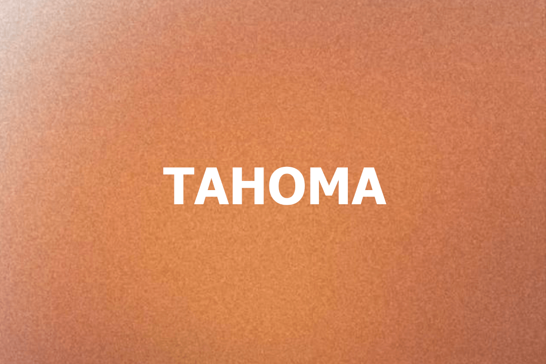
Tahoma
The Tahoma Enterprise Font is a widely recognized typeface known for its simplicity, clarity, and professional appeal. Created by Matthew Carter for Microsoft, this font was introduced in 1994 as part of the company’s efforts to improve on-screen legibility. It is commonly used in corporate documents, digital interfaces, and official communications, where readability and professionalism are essential. Tahoma shines in both small text sizes and larger displays, making it a go-to choice for business reports, email templates, and website content.
Tahoma is best suited for environments that prioritize clean design and efficient communication. Its tight letter spacing and crisp edges ensure that text remains sharp and easy to read on both screens and printed materials. This font is particularly effective in user interfaces, presentations, and legal or financial documents, where precision and clarity are paramount. Additionally, its multi-language support makes it a versatile option for businesses with a global presence.
In summary, Tahoma is a timeless enterprise font that combines modern aesthetics with functional excellence. Designed by Matthew Carter, it has remained a trusted choice for professional use due to its legibility and versatility. Whether in corporate branding, software interfaces, or everyday business applications, Tahoma continues to deliver a consistent and polished look for enterprises worldwide.


